Overview
You’re in great hands.
The Handles with Care appointment app is a solution to make life easier for their clients. This app brings both users and massage therapy together by helping them effortlessly book appointments and ensuring the user is informed on important appointment details.
UX Researcher
UX Designer
UI Designer
My Role:
Timeline:
3 weeks
Google Drive
Zoom
Notion
Figma
Tools:
The Challenge.
Users needed a simple way to browse through services and book their massage appointments.
The company lacked the information and structure needed for users to feel confident while booking their massage appointments. So the challenge my client brought to me was to create an appointment booking process and enhance customer engagement to increase brand awareness.
My client wanted to focus on 2 major tasks:
How might we design a mobile app that would focus on a comprehensible and user-friendly appointment booking process? While providing users with information on the company, services, and details about their appointments?
The Solution.
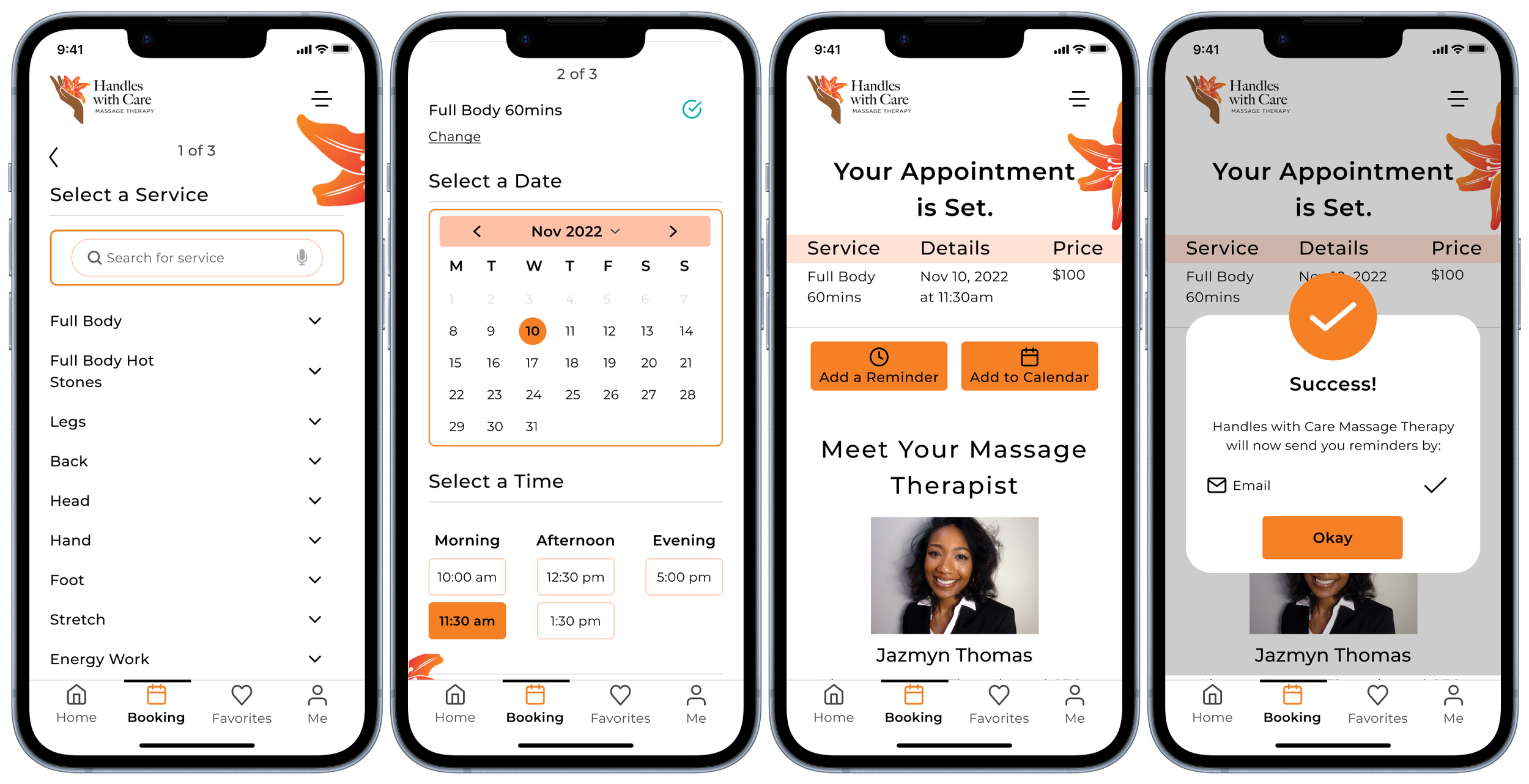
With the Handles with Care app, confidently schedule and confirm your massage appointments within seconds. View helpful health and wellness tips from an expert therapist, set appointment reminders, and contact your therapist all from one easy-to-use app.
The Target Audience.
Tech skills: Moderate - Advanced
Age: 26-64
Career: Corporate office or Blue-collar
The Process
Discovery & Research
User Survey.
Using google forms, I wanted to start my research by creating a survey for users who were familiar with massage therapy and the appointment process to gain usable quantitative data.
Out of 15 respondents:
Schedule their appointments a few weeks in advance
Attend massage therapy due to muscle pain/tension
Found it important to have a 24hour appointment reminder
User Interview.
I conducted interviews with 5 participants, who either caught the bus everyday or a few days a week. As I analyzed my user survey responses, I began to brainstorm questions for my interviewees to take a deeper look into their experiences, wants and pains.
Interview Questions:
What massage/spas do you visit?
a. Can you elaborate on why you visit them?
Can you walk me through the process of how you book your massage appointments?
Why do you book your massage appointments online/mobile vs. in-person?
What do you find most challenging when booking your massage appointments?
Insights and key pain points:
Users want to book their appointments with Confidence.
From their feedback, I could see patterns beginning to form and I was able to identify a few significant takeaways.
Users enjoy it when a booking process is simple and provides much-needed information on the services, company, and employees.
Users enjoy the freedom of booking their appointments. My participants find that using their own devices is more convenient and allows them control.
Users are less likely to book an appointment when the process is overwhelming or isn’t user-friendly. When a site or app is unorganized or isn't responsive, they are less likely to continue their booking process or revisit.
Users book their appointments in advance and find it difficult to check track them.
User Persona.
Empathy Map.
In order to delve further into the behaviors, attitudes, and thoughts of the persona, I created an empathy and journey map.
Journey Map
Information Architecture
User Stories & User Flow.
The original flow had plenty of screens and actions a user would take to accomplish booking a massage appointment. But with further research and user feedback from testing. I gained insight into flaws that were made within the user flow.
Original user flow
Sketches.
Moving into sketching, I started to brainstorm key elements gathered from my research using the Four-Step sketch process.
I began by writing my notes, highlighting the findings and drawings for my ideas.
Notes
Ideas
Then sketched rapid variations for my crazy 8’s to develop the details for my solution.
Crazy 8’s
Solution Sketch
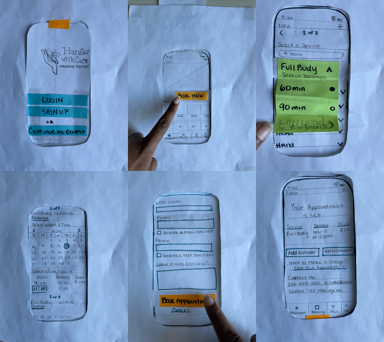
Paper Prototype.
I created a paper prototype to understand how certain functions would work when a user would interact with the app, such as booking an appointment.
Design
Digital Wireframes.
I created digital wireframes in Figma to begin early-stage user testing. I walked each tester through a scenario and gave them three tasks to complete:
Tasks:
Create a new account
Book a massage appointment
Set an email reminder
User Testing.
Using zoom, I conducted three virtual user test interviews with participants within my target audience.
And after reviewing the feedback, I found that:
Positive:
Participants felt that the layout was intuitive and simple to navigate.
Participants found the confirmation page to be helpful and enjoyed how they could view a detailed summary of their recent appointment.
Negative:
Participants found the login/sign-up process to be difficult and/or confusing. A majority stated they would either sign in with their existing google or apple account or click “continue as guest”.
Certain font sizes/styles made sections difficult to see causing accessibility issues for those with vision impairment.
The inactive features caused participants to second guess or feel as if the task was incompleted.
Revised User Stories & User Flow.
With the information obtained from my usability testing, I realized my design solution was not staying within my goal of keeping steps simple. I began my iterations with my user stories and user flow.
While brainstorming, I consider multiple paths like removing the login process entirely but I decided to simplify it by allowing users the option to log in only by verifying their email.
Revised user flow
Final Prototype.
Overall in the final prototype, I prioritized the necessary changes to reflect the new flow and challenge to create the final solution for my lo-fi prototype.
Improvements:
Simplified the login process so users had the option to log in only by verifying their email if they didn’t have an account or didn’t need to create an account.
I changed the font to Montserrat and increased the sizes of text and buttons to adhere to accessibility standards.
With the HWC appointment app, users have the ability to:
Easily and quickly schedule their desired appointment.
Review appointment details and set appointment reminders directly on the app.
Gain insight into the company and its therapist. Ensuring that we strengthen customer trust, engagement, and brand awareness.
Brand & Identity.
My designs express ideas about connection, warmth, safety, playfulness and power.
Branding Colors
Branding Typography
Moodboard

Final Designs

Conclusion
What did I learn?
This being my first time participating in a three week design sprint, I learned:
The importance of rapid iterations - and having the ability to make quick revisions were found to be super important and helpful throughout this sprint.
Time management- since this was a three-week sprint, it was important that I managed my time properly to meet deadlines.
With proper research equals great results- the more detailed and in-depth you go into your research will provide a greater solution
Focus on features that serve a purpose- During my testing I saw that users were getting confused about features that were not apart of the task. Next time I want to prioritize the key features and eliminate anything that could distract or overwhelm the users


