Overview
Founded in 1962, Walmart has been one of the leading retail companies in the world. They aim to provide consistent discounts, loyal customer service, and fast friendly solutions. But their e-commerce platform needed help when it came to structure and usability. I have always been interested in the e-commerce industry and felt Walmart has a lot of potential to be a great online retailer but the website had some key issues that needed improvement. This redesign solves that issue by taking the hassle off browsing through their 1000s of products and brings back the fast-friendly solutions Walmart aims for.
UX Researcher
UX Designer
UI Designer
My Role:
Timeline:
4 weeks
Google Drive
Zoom
Notion
Figma
Tools:
The Challenge.
As I conducted my initial research, I found the homepage was underutilized due to being overpowering with hundreds of product images, intersecting with sponsored listings. The site lacked uniformity in how the various categories are presented and organized.
My task:
Identifying shoppers' pain points
creating a smooth, easy-to-use, customer-centric experience that focused on shoppers' needs
The Goal.
Focusing on the problem, the goal was to make a seamless online experience by:
Increasing visual hierarchy
Designing a user-friendly and intuitive interface
Ensure the brand identity is consistent throughout the website
Decrease the time a shopper takes to find the desired product and add it to cart
The Solution.
Walmart's e-commerce redesign gives users the power to shop with ease and find their desired products without the challenge of cognitive overload and frustrations. The homepage eliminates unnecessary distractions from competing elements and sponsorships listings.
It now features high-quality product images that showcase top deals, new arrivals, and essentials, and users can see all items listed in their cart as they continue shopping. There have been several enhancements, such as making it more organized, improving readability and personalization on recent purchases, deals and suggestions from buying habits making it easier for users to find what they need.
The Target Audience.
Gender: Male and Female (evenly split)
Age: 18-34
Income: Middle-Upper Class Consumers
The Process
Discovery & Research
User Survey.
I began my research with a user survey to gain insight into the desirability of users’ shopping habits, needs, and demographics.
Out of 34 respondents:
Purchase their products from Walmart's online store
Prefer to see savings/deals
Find that the search functionality is an important feature when shopping
Spend up to 60 seconds looking for their desired products
Competitive Analysis.
While simultaneously working on my survey, I wanted to start research for my competitive analysis. I proceeded to conduct research on some of the direct competitors like Amazon, Target, and Best Busy. As well as, indirect competitors like Etsy. During the analysis, I wrote down some of each website's major strengths and weaknesses.
User Interview.
With the information I collected, I interviewed 3 people within my target audience who were familiar with the online shopping experience.
My objective was to:
Understand how the users navigate through online stores
Identify the pros and cons of shopping online
Understand what features were needed to smoothly navigate through the online store
Learn about the needs, motivations, and current pain points that the users face when they shop online
Insights and key pain points:
My interviews provided key insights into how to create this website and what to focus on.
Participants need organization
Participants find Walmart’s homepage to be overwhelming and disorderly
Participants are motivated to shop online because of its convenience features and wide range of product delivery selections
Participants want a clean and modern visual aesthetic
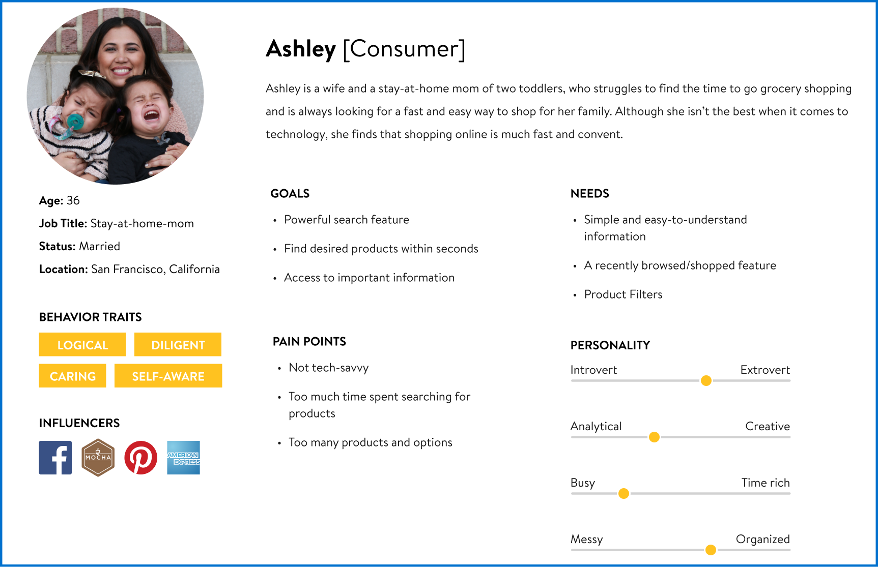
User Persona.
With all the information taken from my competitive analysis, survey, and user interviews combined with my target audience, I could create my personas. Which helped me better empathize with my users' needs by examining the problem more carefully from the user’s perspective.
Information Architecture
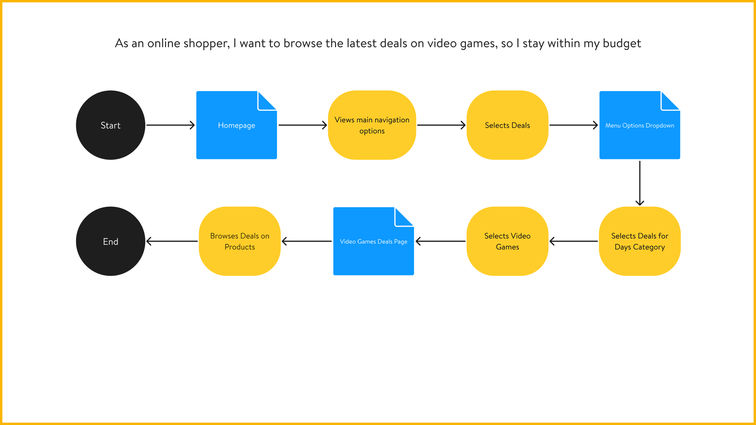
User Stories & User Flow.
I created user stories based on tasks and possible motivators. I then prioritized the list to focus on my user’s needs in a minimum viable product also known as MVP.
User Stories:
As an online shopper, I want to browse the latest deals on desired products, so I stay within my budget
As an online shopper, I want to view a list of products that I’ve placed in my cart, so I can review my selections
As an online shopper, I want to use the search feature, so I can quickly find my desired product
As an online shopper, I want to add items to my favorites, so I can purchase them in the future
As an online shopper, I want to view a list of suggested products, so I can browse similar products based on my buying patterns
As an online shopper, I want to choose how I want my product received, so I can have the convenience of pickup or delivery
I narrowed my scope to focus on creating user flows that would cover the users’ needs when shopping online.
I decided not to create user flows and design functionalities for all my user stories that didn't require multiple steps.
User Flows:
Sketches.
To create the sketches, I researched how my competitor structured their homepages and prioritized my ideas from my user stories and user flow to best determine the placement of my layout.
Design
Digital Wireframes.
Using my sketches and user flow, I began to develop several digital wireframes using Figma.
Homepage
Menu with popup product card
Homepage with side cart menu
Brand & Identity.
For branding, I knew it was important to follow the brand's identity throughout the website. To ensure consistency, I researched the brand's logos, the colors predominantly used for the site, buttons, icons, and typography.
Moodboard
Prototype.
I combined my wireframes and branding to create my prototype but before I started testing, I wanted to get feedback from peers and mentor.
Original Prototype
Revised Prototype.
Feedback:
Reorganize the layout to bring awareness to deals.
In my sketches, I neglected to think about the user’s needs for shopping for deals. It was important users could access the site’s deals without needing to search for them.
Improvement:
Rearranged the organization of the homepage by bringing the deals for days feature up to catch user’s attention and allow for easier access
Feedback:
There needed to be a flow to show where a user would go if they used the search feature or top navigation to find the desired product.
Improvement:
Designed an additional product list page
Once I evaluated my designs, I felt ready to start user testing.
User Testing.
I wanted to see if my participants could navigate the flow of design, ease of navigation, and how a user could find an item and add it to their shopping cart. These tests were conducted in person and remotely using zoom.
Feedback:
The product cards needed something for them to stand out from the neutral background. Also, product cards needed better unity to create a sense of harmony.
Improvement:
Added a drop shadow to create an elevating effect
Adjusted the placement and spacing of elements for better visualization
Feedback:
Participants stated certain texts were difficult to see due to size and color.
Changed the blue text on the product listing page to black
Increased the size of the text in the top navigation from 14px to 20px and the bottom footer from 14px to 16px to meet the WCAG accessibility standards
Improvement:
Final Prototype.
Overall in the final prototype, I analyzed the existing patterns in the industry and redesigned them to create new opportunities. I took a deep dive into the user's needs and motivations, then translated my findings into a design. The outcome is a more efficient, better-performing site with more relevant features that focus on improving the customer shopping experience.


Final Prototype
Conclusion
What did I learn?
Out of all three projects I’ve done at Thinkful, this project was a great experience. Having the opportunity to explore the e-commerce industry and redesign Walmart's site allowed me to think about the needs of the end-user and business. I am glad to learn that even by making small changes, I was able to yield a big impact and create a great experience for users.


