Never miss your bus again.
Roote is a mobile app designed to take the hassle off the on-the-go commuter by providing the latest transit information and a live map with real-time bus tracking.

Overview
UX Researcher
UX Designer
UI Designer
Role:
Target Audience:
City dwellers & Public commuters
Location: Urban and Suburban
Notion
Figma
Google Drive
Maze
Zoom
Timeline:
5 Weeks
Tools:
The Problem
Due to the Midwest Transportation Agency’s expansion, an increasing number of bus routes have been added to their bus stops. Only listing the bus schedules on their website and bus stops, they failed to think about traffic, out-of-service buses for maintenance, and longer-needed stops to assist handicap passengers. All of which created inaccurate bus arrival times.
The client wanted an app that would focus on solving three main problems:
When specific buses would be arriving
How much time commuters had to get to specified bus stop
To preview a list of future bus schedules for specified bus routes
The Goal
Focusing on the problem, my goals for this project were to:
Achieve the needed requirements provided by the client
Meet the needs and frustrations of the users
Design a simple and intuitive UI for the on-the-go commuter
Provide important bus information in just a few clicks
The Solution
Let’s simplify commuters’ travel needs.
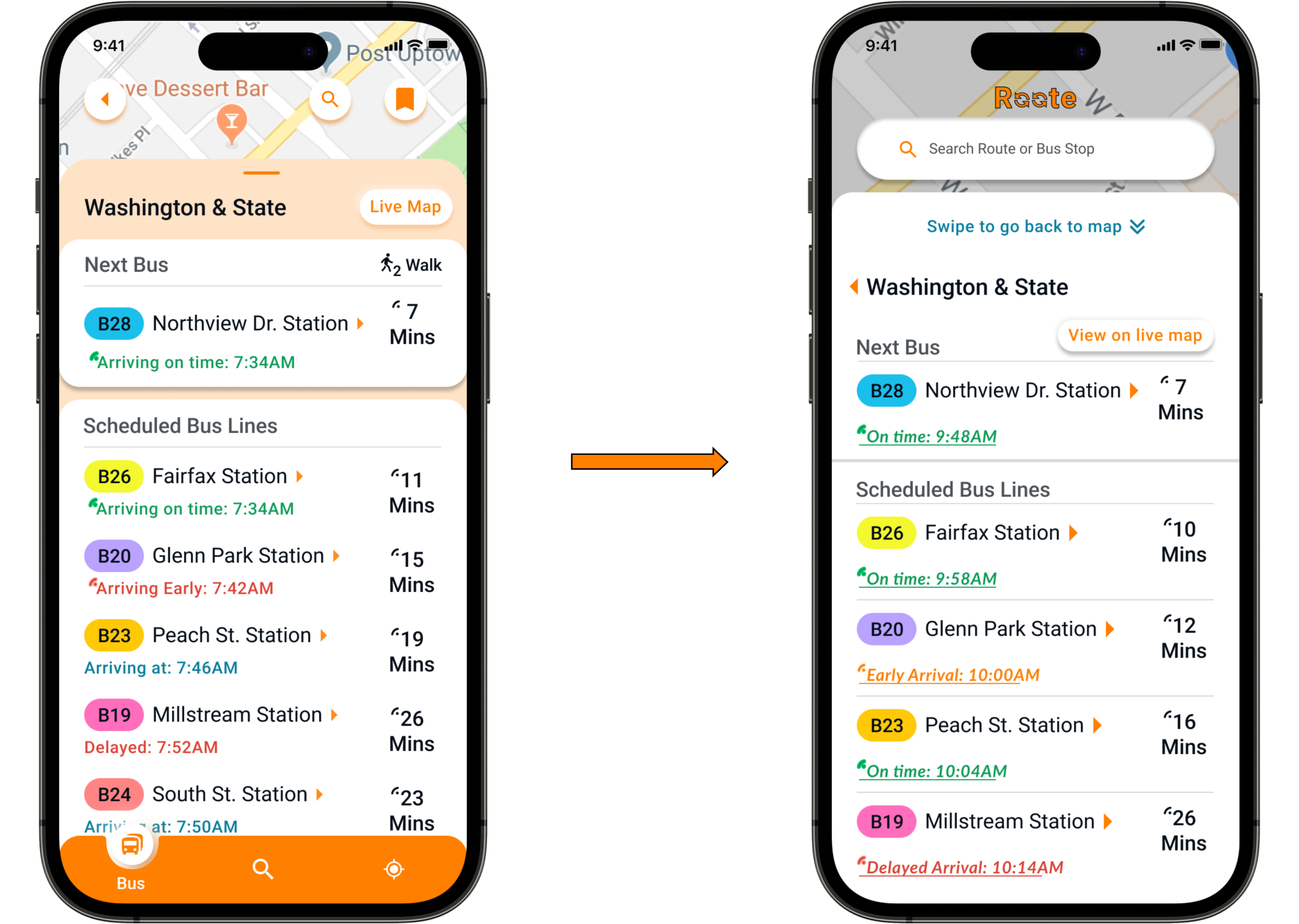
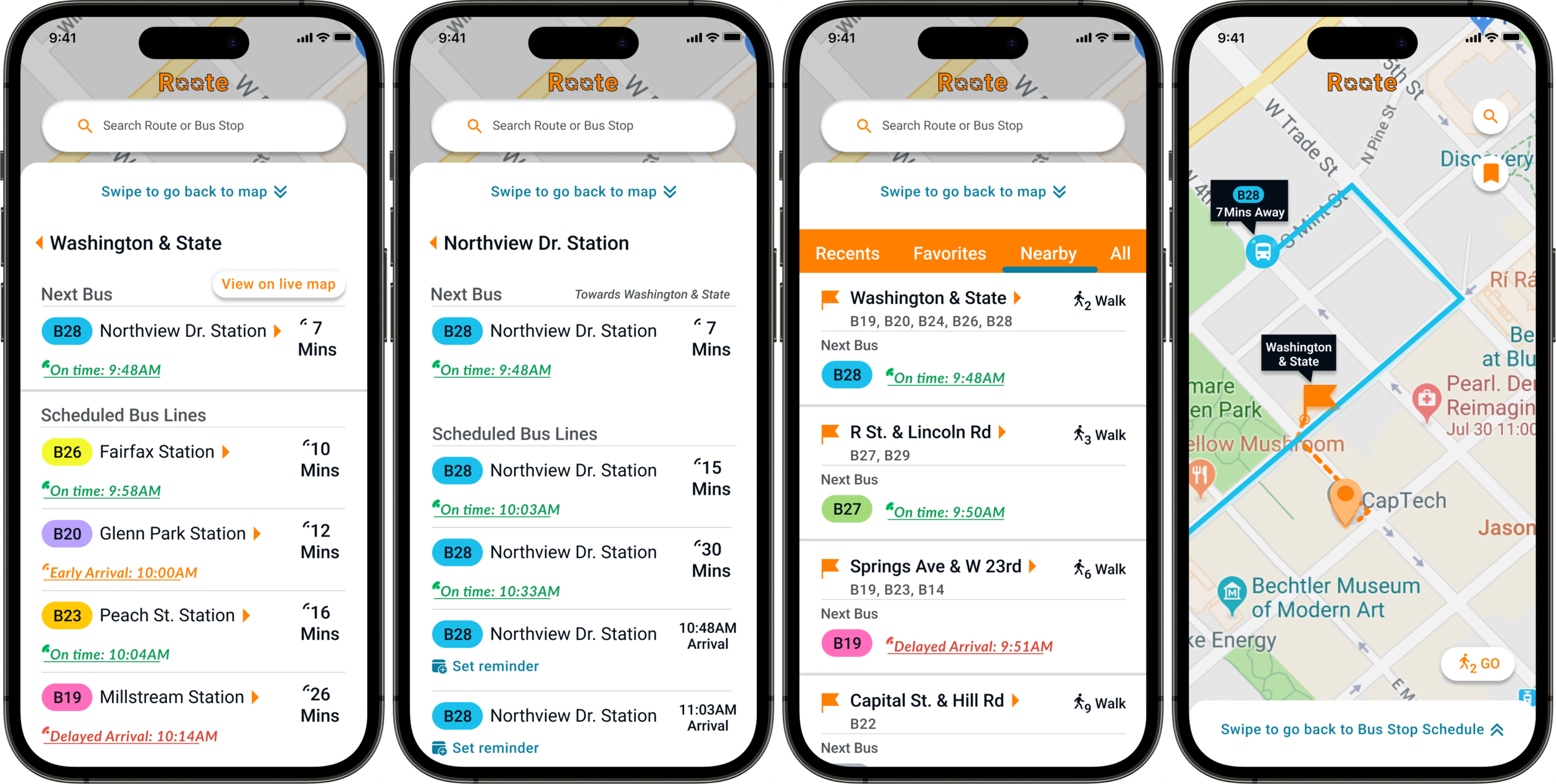
Prioritized “Next bus” & Live updates
Live Map with real-time bus tracker
Nearby Toggle
Competitive Analysis
Discovery Starting with my competitive analysis, I explored the three most known public transit apps to understand their strengths and weaknesses, as well as gain an understanding of the user expectations when using these apps.
Updates on delays or early arrivals
Brand awareness
Neat & easy design
Cognitive overload
Bus commuters aren’t prioritized
Prioritized the latest alerts
Poor UI & an overwhelming amount of ads
After comparing these apps, I found a key pattern, bus commuters still didn’t feel like a priority and lacked needed transit information.
User Survey
Using Google Forms, I designed my user survey to gain usable quantitative data that gave me insight into users’ feedback, pain points, and desires.
Out of 55 participants, 39 road their city's public bus.
When asked “What factors are important to you as a bus rider?”
Accurate bus arrival times
Options to preview future bus route schedules
User Interview
I conducted interviews with 5 participants, who either caught the bus every day or a few days a week. As I analyzed my user survey responses, I began to brainstorm questions for my interviewees to take a deeper look into their experiences, wants, and pains.
Interview Questions:
What transportation app do you use and why?
Describe a time when you faced challenges or frustrations while using your transportation app.
Tell me about the steps you take to ensure you make it to your scheduled bus on time.
How does the app contribute to achieving the goal of making the bus on time?
Insights:
Commuters want Simplicity and Efficiency.
From their feedback, I could see patterns beginning to form and I was able to identify three significant takeaways.
Users have a greater experience when an app allows the flexibility to plan and preview their desired route ahead of time.
Users find it difficult when arrival times are incorrect and doesn’t properly communicate new arrival time or their buses location.
Users want simplicity and don’t want to think too much when searching for a bus stop or route.
Back to Top ☝️Persona
DefineJourney Map
Using Tara as a primary commuter, I developed a journey map to help visualize their needs as they accomplish their goal of making it home.
Imagining the actions and emotions Tara would confront along the journey, helped me to ideate design opportunities.
DesignUser Stories
Focusing on the scope of work, I began my user stories to prioritize the features of the bus transit app. This helped clarify what should be included and need the needs of the minimum viable product (MVP).
As a rider:
I want to see a list of future bus lines that are scheduled to arrive.
I want to know when the next bus is scheduled to arrive.
I want to know how much time I have to get to the bus stop.
User Flow
For the user flows, I created the path a commuter would take to complete the high-priority tasks established in my user stories.
Sketches to Digital Wireframes
Prototype & testAfter creating user stories, user flows, and a site map, I sketch out the look of my UI. I used the Four Ups method to jump-start my brainstorming process and churn out quick iterations.
Once I felt I had a good start, I then quickly laid the wireframes using Figma.
Digital Wireframes
I wanted to focus on the goal and users’ needs by keeping the design simple and easy to use for an on-the-go commuter. After completing the wireframes, I conducted in-person user testing to receive feedback.
Feedback:
The search screen caused cognitive overload with unneeded options.
The live map screen lacked needed bus location information and wanted a way to begin a journey without having to go back to the beginning screen.
Prototype
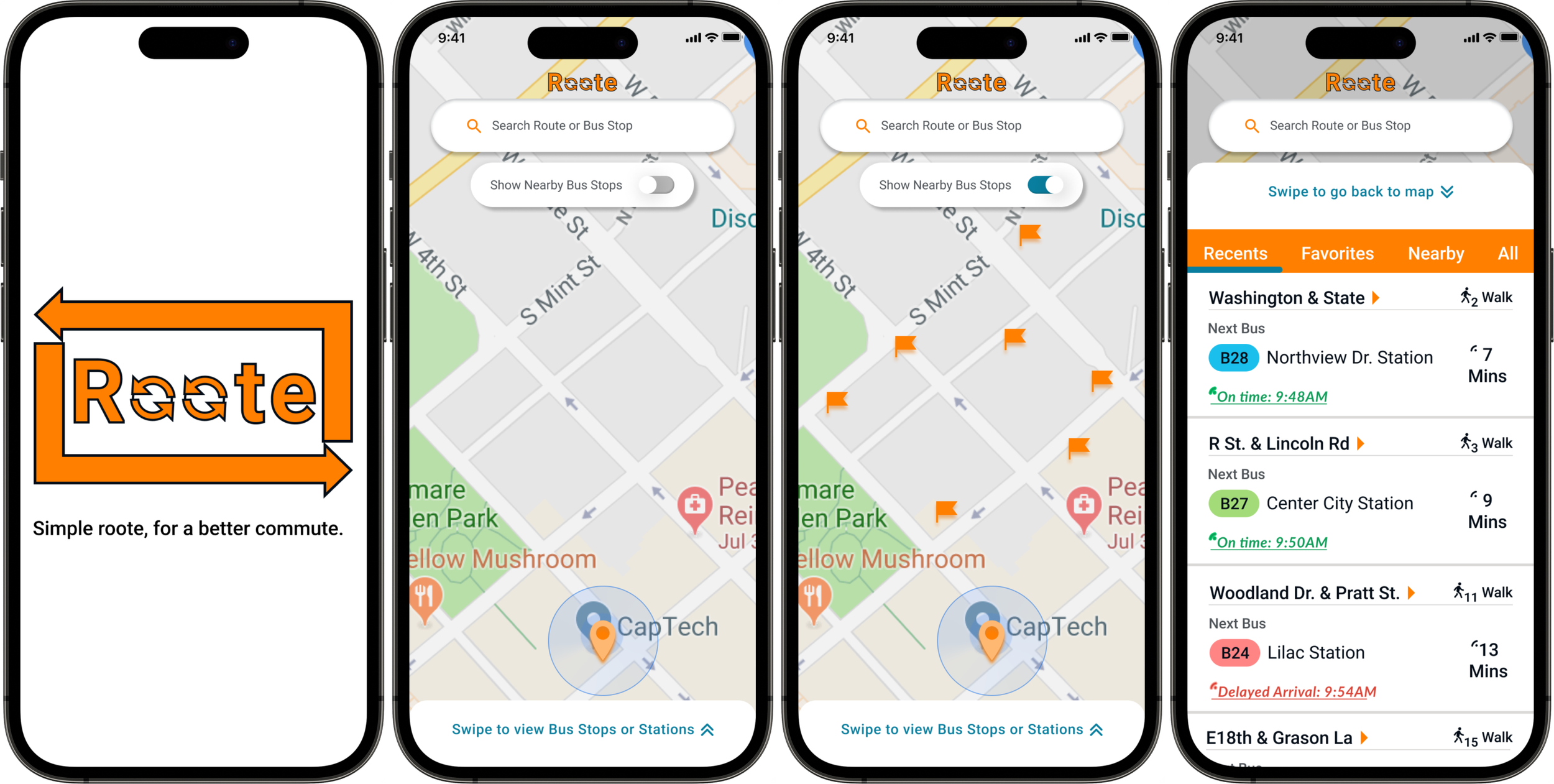
I applied the branding to my wireframe to create a clickable Hi-fi prototype. I used the feedback I previously received to start my UI design. I separated the search screen by giving the search bar hierarchy and removed the 'Recents" tab to reduce cognitive overload. I also included a swipe-up page on the live map screen, allowing users to view detailed options for when the next bus would arrive at the bus stop and a list of future bus schedules.
After a series of iterations, I felt I had achieved a good starting base to begin user testing my hi-fi wireframes.
Using Maze.co I formulated a list of scenarios and tasks for users to complete. And after receiving feedback from various participants, peers, and mentors.
I found 2 significant improvements.
User Testing
Feedback:
Participants were having difficulties finding nearby options for bus stops.
Improvement:
Completely getting rid of the button nav and replacing it with a swipe menu.
Add a nearby toggle on the search screen for faster access without leaving the search screen.
The orange background started to become washed out on the map.
Buttons and links were not strongly visible causing inaccurate and indirect clicks.
Feedback:
Improvement:
Added an overlay to the map to provide contrast.
Bring contrast to buttons to ensure they stand out.
Made the “Arriving on time” link more defined so users know they are able to click on it for a live map.
DeliverFinal Screens
Final Mockups

Conclusion What Did I Learn?
First project = A lot of mistakes but A TON of improvements.
Being that this was my very first project during my time in the Thinkful program, I learned a lot from the mistakes I made like:
Iterate, Iterate, Iterate! - Nothing is ever 100% done, there is always a need for improvement.
Keep the project focused on the main points the client is trying to solve - Many time I had to refer to the requirements and iterate designs to ensure I stay within the scope of work.
Stay within WCAG ( Web Content Accessibility Guidelines) standards as much as possible - Ensuring that CTA’s, clickable links, icons, and type are all visible by size and color. Not only does this assist those who may be visually impaired or colorblind but overall allows for a better design.
Back to Top ☝️Visit My Other Projects
Handles with Care
Massage Therapy App
Walmart
E-commerce Redesign


